
Design Meanings
Spiderweb SVG for Halloween Shirts: Corner Webs, Cute Spiders, and Design Tips
Spiderweb SVG for Halloween Shirts: Corner Webs, Cute Spiders, and Design Tips
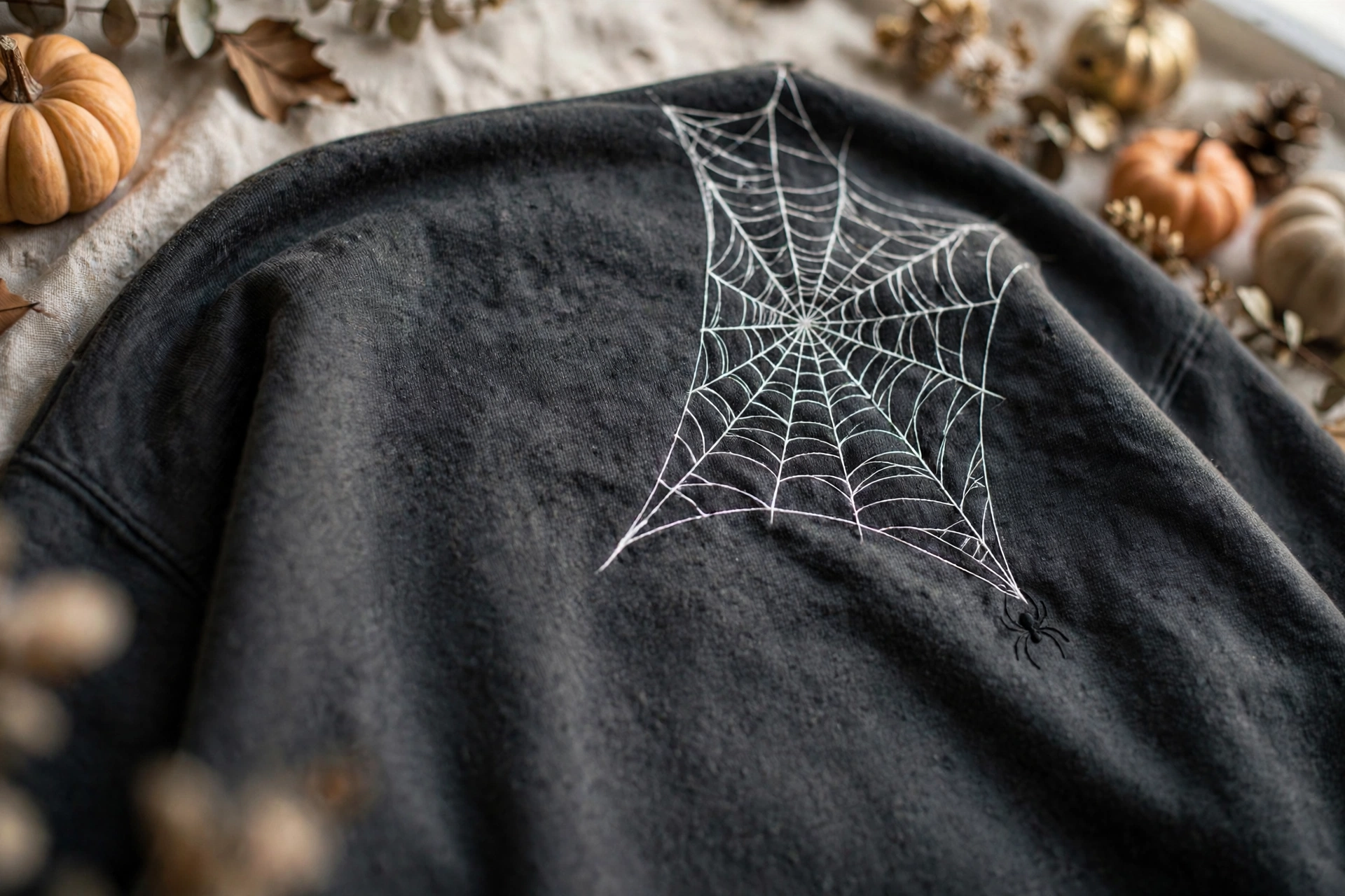
The spiderweb is Halloween’s quiet achiever. It needs no introduction, occupies almost any corner of a garment, and makes whatever sits next to it — a ghost, a pumpkin, a haunted house — look more deliberate. That flexibility is why web graphics spike every September and October, and why they are spiking again now, building day by day into the strongest part of the season.
A web also carries a small, satisfying piece of symbolism. In Halloween imagery it signals age, mystery, and things left undisturbed — the attic corner, the abandoned house, the gate nobody opens. Designers like it for the opposite reason: it is pure geometry. Radiating lines and concentric curves impose instant order on a design, which is why a well-drawn web can organize an entire shirt. Here is how to choose and use one well.
The Main Spiderweb Styles, and Where Each One Shines
The corner web. The hardest-working format: a quarter-web anchored to two edges of the print area that frames other elements without crowding them. Ideal when you already have a central character or phrase and just need atmosphere, and it still reads instantly when shrunk to a pocket-area accent.
The full round web. A complete radial web, usually centered, with the spider suspended in the middle or hanging below on a single thread. A statement design that wants the whole chest — the strongest standalone choice for a sweatshirt or hoodie where the print can stay large.
The layered scene web. A web faded into the background behind bats, ghosts, or a haunted house, printed tonally so it whispers rather than shouts. The most sophisticated option; keep it at least two shades from the garment color so it reads as depth, not dirt.
The cute web. Thick, rounded lines, a smiling spider, maybe a heart in the center. This family-friendly direction dominates kids’ shirts because it delivers the theme without the creep factor, and it tolerates small sizes better than fine-line webs do.
Choosing one file for many projects? Take the corner web. Making the shirt itself the project? The full round web makes the strongest single impression.
Spider or No Spider? A Small Choice That Changes the Mood
Adding a spider shifts the tone more than any other single edit. A bare web suggests haunted places — elegant, architectural, slightly gothic. Add a small spider, especially one dangling from a thread, and the design becomes a creature feature: playful or creepy depending entirely on the spider’s style.
Realistic, long-legged spiders push the design toward horror and work best large, where the leg detail survives. Round, cartoon spiders with simple dot eyes keep things friendly at any size. As a practical rule, the smaller the print, the rounder the spider should be — fine legs are the first detail to vanish when a design is scaled down or printed on textured fleece.
Placement matters too. A spider hanging below the web on a visible thread creates a natural vertical line that flatters the center of a shirt. A spider sitting in the web’s center competes with any lettering, so if you plan to add text, hang the spider off to one side and let the text own the middle.
Placement Ideas That Make a Shirt Look Designed, Not Decorated
Where the web sits is half the design. A corner web spilling from the shoulder seam toward the chest looks like it grew there — far more convincing than the same web floating in a rectangle in the center. Similarly, a web anchored to the bottom hem, with a tiny spider climbing the side seam, rewards a second look in a way centered graphics rarely do.
For hoodies, consider the hood itself or the pocket edges as anchor points, keeping the main chest area free for a character or phrase. For matching sets — family shirts, friend groups, classroom tees — one shared web in the same position with a different small character on each shirt reads as a collection rather than a copy, and it photographs beautifully.
Negative space is your ally. Webs are line art, and line art needs room. If a design feels busy, removing the smallest inner rings or widening the gaps between curves usually fixes it faster than changing anything else. On dark garments especially, a slightly bolder line weight with fewer, cleaner rings prints more crisply than a dense, delicate web.
Color, Line Weight, and Print-Quality Checks
White on black or charcoal is the classic for a reason: maximum contrast, a convincing moonlight-on-silk effect, and total forgiveness on distressed textures. Beyond that, metallic-look golds and silvers (printed as flat ink, they still catch the eye), soft lavender for cute designs, and faded bone for vintage looks are the reliable palette. Avoid thin red lines on black — the combination vibrates visually and can look blurry at a distance even when the print is perfect.
Line weight is the silent quality factor. At final print size, the thinnest web strands should still be thick enough to hold ink without breaking up — if you zoom in and the curves look hair-thin, they will print that way. Well-made SVG artwork keeps a consistent minimum thickness and uses clean, compounding paths so the web cuts or prints as one coherent piece rather than dozens of loose segments.
Before committing, preview the design on your actual garment color and at your actual size. A web that sings at twelve inches wide can turn to lace at four. Either reserve fine-line webs for large placements or choose a bolder, simplified version for small ones. One quick test print on a scrap or a sample garment will tell you more than any amount of zooming on screen.
What the Spiderweb Means in Halloween Design Language
Webs are nature’s abandoned architecture — beautiful, geometric, a little melancholy. On a shirt they borrow that mood instantly: age without gore, spookiness without a monster. That is why they pair so naturally with haunted houses and moonlit scenes, and why they can carry a design alone when a character would be too much. The best versions respect real web geometry — radial threads for structure, spiral threads for capture — and that true symmetry is what keeps the design looking right long after October, layered under a jacket as a year-round gothic detail.
The formula, then: honor the geometry, give the lines room, match the spider to the print size, and check the file at real scale before you commit.
Frequently Asked Questions
What is the difference between a spiderweb SVG and a cobweb design? In design listings the terms overlap. Generally, a spiderweb shows clean radial geometry, often with a spider, while a cobweb leans messier and more distressed — the abandoned-corner look. Choose by mood: tidy webs for graphic shirts, messy cobwebs for haunted textures.
Can a spiderweb design work without any other Halloween elements? Yes. A full round web, centered and printed large with strong contrast, carries a shirt on its own. A corner web usually wants a partner element, even if it is only a small spider or a short phrase.
Why does my web print look broken or faded? Usually the lines are too thin for the print size, or the ink-to-garment contrast is too low. Thicken the line weight, simplify the inner rings, or switch to a higher-contrast ink color, then test at final size before a full run.
